 |
This was technically the first insignia I ever designed, and actually
the credit shouldn't really go to me, but my older brother, who once
showed me how to crunch all the letters of my name together. M A T T,
after all, has a lot of nice straight lines and sharp angles that can
be overlapped (a la Volkswagen).
There are more stylized versions, but somehow I think the handwritten
version stands out better. |
 |
In high school, I started a video production company
called Chapter Eleven Alternative Media, and our intention
was to create 3D films. Unfortunately, the cost of the technology
at the time (technology the Texas-based VREX had a virtual chokehold
on) made realizing this dream wholly impractical, so not only did
we change directions relatively quickly, but we also never had time
to devise a proper logo. |
 |
Harvest, the 2nd previous incarnation of Crystal Dreams Video
Productions arose out of two--almost three--sources,
the first being the video game Body Harvest for the
Nintendo 64, the second being a combination of the
Star Wars main title font and the original codename
for Return of the Jedi. |
 |
This was the first Crystal Dreams logo. Actually, it was more of
a title sequence than anything else; the camera transitioned from
black and white to color (which was reversed to make white text on
a black background) andthen back again. The title card was literally
a card; dissatisfied with the look of ugly, gen-lock title generators,
I got the idea of simply printing my titles and credits out onto card
stock and then shooting them with a photonegative effect filter. |
 |
What I didn't realize at the time was that incandescent
light on cardstock actually turns the card a dull yellow,
which, in photonegative, created the image of white text
against an odd, blueish-grey background (AOT solid black),
which I actually thought looked very cool once I saw the
result on a TV screen. |
 |
For the longest time thereafter, the Crystal Dreams logo
was actually not a logo at all: simply a red, stylized font
with moody, atmospheric music was all I felt I needed to
convey the awe and mystery that was...really just me, a
camera, and some other miscellaneous bits of equipment.
People always ask me where "Crystal Dreams" came from.
Some thought it was a reference to an Anne McAffrey novel,
others thought it had to do with Crystal Meth. Actually,
the name comes from a cancelled N64 game called Robotech:
Crystal Dreams. |
 |
Suddenly, out of the blue, I was writing down the initials
of Crystal Dreams (C D V P) and got an idea to try and put
the letters into some kind of geometric formation. Several
pencil sketches and forty or fifty-some Powerpoint slides
later... I still wasn't very happy with it. This is the one
I ended up finally using in a video. The "V" is red mostly
to make the logo stand out, but also because V is 5 in Roman
numerals. My student ID number started 533. C is the third
letter of the alphabet, so swapping numbers for letters, the
first three numbers of my student ID spelled VCC, or Venus
Crystal Company, a reference to the story "In The Walls of
Eryx" by H.P. Lovecraft and Kenneth Sterling. |
 |
I call this "the NASA one" because the image is actually taken
from a photograph of a sort of "test pattern" used by NASA
to test the effects of cosmic radiation on color film.
Unfortunately, the photo's description never really said what
the original colors of the square were, so they could be faded
variations on blue, red, yellow, and grey. On the other hand,
it does make for a very appealing color scheme. |
 |
Recently, I've tried integrating my initials into the same
formation as the Crystal Dreams star logo. Several more
sketches and powerpoint slides later... this is probably
the best of them. Maybe if the letters were metallic...?
Anyway, another thing people ask me is the significance of
the name Crystal Dreams. Is it saying that dreams are like
delicate crystal and can break easily unless you work hard
to put the dream into a tangible, accessible medium? Is it
referring to our clarity of vision as a creative entity? To
be completely honest, it doesn't really mean anything, I just
liked the way it sounded...and I still do. |
 |
The letters still need to look beveled, but generally I was
happy with the way the metallic look turned out. |
 |
People often seem to forget that metal is fundamentally
a reflective material, so depicting it in a graphic
always lends itself to two problems. First of all is
the issue of a 'camera' which may not seem like a
problem, but consider the challenge of finding an
accurate reference. I mean, the metal will always
be reflecting you when you look into it. The 2nd
problem is the matter of background. If say your
metallic surface is the hood of a car driving
across a desert road during sundown, do you continue
the background in the reflection and risk making
the object look like glass instead of metal?
|
 |
M-World was a story whose very idea goes back to
the tender age of four, when all I had was a book cover
and title. The story would come several years later, during
college (where everyone acts like four-year olds, appropriate,
isn't it?). The logo, like all the others, is one of several
incarnations. I chose this runt of the litter because I like
the way the metallic letters turned out.
In case you're wondering...No, M-World does not mean "Matt
World," "Matsugawa World," or even "Man-World" (though gender
roles were an integral part of the story), and it certainly is
not a Star Trek reference! I guess if I really had to come up
with something, I would say the "M" stands for "Meaningless!" |

| The Omega III is a fictional video game system that
used Iomega Zip Disks for storage media. Inspired by systems
such as the Famicom Disk System and the Fairchild Channel F,
Omega III's color scheme is a reference to Hong Kong pirated
versions of famous NES games, which often had loud and flamboyant
color schemes. |
 |
This was the first 'game' published under the VCC
label for the Omega III. The disk was little more than fancy
packaging for my portfolio and resume. Unfortunately, no one
really uses Zip Disks anymore, which really made it perfect to
have as a storage medium for a bogus game system. Time Wars can
also be seen in its feature film form (read: the poster) in the
spec ad section of the site.
Also, the VCC logo was simplified for size. |
 |
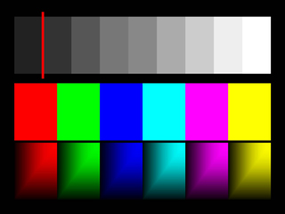
I took a lot of video production courses at UNM,
and one of the things that was always required was a set of
color bars at the beginning of our videos. In a desperate
attempt to break the mold and look at the purely creative
side of color bars and test patterns, we were all called
upon to create our own color bars. And, like every other
logo or pattern I designed, I went through several dozen
incarnations before deciding that this was the only one
that was not only different from traditional color bars,
but was also had practical value and use. All the colors
are to perfect colorsync specifications and it is entirely
possible to calibrate your computer or television by them. |
 |
Caduceus is an Unreal Mod I've started working on in recent weeks.
Without giving too much away as to the gameplay mechanics (other
than it will not be a first-person shooter), Caduceus is story of
a medical frigate overrun by over-sized mutated leech monsters.
You play as the renowned Dr. Origin Egress, who has traded in her
labcoat for a hazard-suit as she tries to solve the mystery that
has cost the crew their lives.
Origin Egress was also the protagonist of the interactive video
exhibit "Fairchild: Aesthetic Perfect." Though it is technically
the same character, the world of Fairchild is in no way related
to Caduceus. I simply like to take my characters and put them
through as many wringers as possible and see which ones make it
through in one piece. Dr. Egress has survived many turmoils thus
far, and she always surprises me with her spirit. |
 |
Just a little something I whipped up one day when I was bored.
I just wanted to play with outlines and shadows, make the word
seem like more than it really is. Also, I was trying to break
away from the notion that when you make a stylized font, you
must first create an entire alphabet. This is done, of course,
because all the letters ideally should be distinct from one
another. The problem with this is, though, that you end up
limiting yourself creatively. In the case of "BATTLE" I knew
exactly which letters I would be using, so I wouldn't have to
worry about the "T"s looking like lower-case "R"s. |
 |
This was an "Identity Idea" for an individual very important to
me. She helped me to see who I was and what I wanted to do at
a time when the long-hidden expectations of others around me
were becoming unbearable. She has a way of seeing the truer
natures of people without it resulting in cognitive dissonance.
The "L" flowing into the "M" shows her ability to not only make
one idea flow into another, but to also bring that idea back
full circle to the overall point of the lesson she was teaching
or the observation she was making. If you run your finger from
the start of the "L" to the last leg of the "M," you are
ultimately moving in a more-or-less circular fashion. |
 |
Psygnosis (Video Game Developer & Publisher)
This logo is considered by many, particularly in the computer
and video games industry, to be one of the most appealing logos ever
conceived. It was, in fact, created by Roger Dean, who not only
did album covers for the Prog-Rock sensation Yes, but also did
box covers for Psygnosis in their early days. Hard to believe
that this was the same publisher/developer that gave us Lemmings! |
 |
Lotus (Automobile Manufacturer)
I've you have ever seen either an episode of Patrick MacGoohan's
The Prisoner or the James Bond feature The Spy Who Loved Me, you
have seen a Lotus. MacGoohan's car seen in the opening credits of
his popular series is a Lotus Super 7, a very popular formula racer.
Meanwhile, the car in Spy Who Loved Me, the one that turns into a
submarine, is a Lotus Esprit. Today they are best known for the
Elise, reputed to have the best handling of any sports car today.
The initials above "LOTUS" stand for Anthony Colin Bruce Chapman,
the company's founder. His infamous involvement in the development
of the DMC-12 (namely the 'offshore tax shelter' GPD) led to his
name being removed from the company (and utterly decimated his
ambition of being knighted). However, fan reaction was extremely
vocal, and the name was restored after only a few years. |
 |
Knights of Columbus (Charity)
On top of this simply being a very intriguing design, it is also here
as a tribute to my grandfather, who died of prostate cancer some years ago.
A lot of people ask, "Who are the K of C?" and all I can ever really think
to say is that they are the proudest and most dignified people you will
probably ever meet. When my grandfather died, he even had an honor guard,
in full uniform, swords raised andall. You should really check out their site,
they do some great charity work and after all, everybody needs a little K of C. |
 |
Pabst Blue Ribbon (Beer)
Of course, I cannot talk about iconography without giving proper
credit to my homeland brew, PBR. This, along with Budweiser's old
label--before they went to that goofy, red-crayon crown symbol--truly
demonstrates a sense of history, something few logos can do without
coming across as pretentious and stale. |
 |
Saab (Automobile Manufacturer)
What's the difference between a Saab and a Porcupine...?"
Okay, okay, you've heard it! Nevermind! Anyway...
Along with manufacturers like Jaguar, this one has fallen under the General
Motors Umbrella. Come on, England! What's going on? First, you get rid of
your double-decker buses, then you start ripping up those lovely red iron
phone boxes, then start slapping ads on your black cabs, and then you let
your local pubs get bought out by major chains! For shame! |
 |
BMW (automobile manufacturer)
My brother told me that he once asked me, "if I could have any car in
the world, which one would it be?" He said my answer was "a Geo Storm."
After a blank stare and a shake of the head, he said, "No, dude...if
you could have ANY car...in the WORLD...WHAT would it be?" According to
him, I still said, "Geo Storm." Looking back, I wonder how I could ever
have said that.
The BMW logo has a very pleasant color scheme and the shape most definitely
sets it apart from the crests and shields of Chrysler or Porsche. As many
know, BMW was an aircraft manufacturer before the Treaty of Versailles
barred them from producing aircraft. The logo depicts propellers spinning
against the blue sky. It is also the Bavarian Coat of Arms. Coincidence?
Oddly enough, according to BMW at least, yes! |
 |
Alfa Romeo does not distribute in America, so I'm stuck driving
my Pontiac (a Sunfire), while somewhere else in the world, there's a
156 GT 5-door waiting for me. Ah, well...someday. In the meantime, I can
admire their very interesting logo. I wonder if a lot of doctors have
Alfa Romeos? I mean, if the Honda CRX can be popular among Christians
(CRX is the latin word for 'cross' with the vowels removed, and have you
ever seen a CRX that didn't have one of those fish icons on it?), maybe
the snake and cross can appeal to those in the medical profession. |
 |
Traveller's Tales (video game developer/publisher)
Traveller's Tales doesn't have so much a logo as much as a work of art. It
sticks out like a sore thumb against the plain white text of most game
studio logos. Heck, even Konami has abandoned its red and orange waves in
favor of a simple red flag. Today, the only studios whose logos even
approach the creativity and imagination of Traveller's Tales are Planet
Moon, Cattle Call, Falcom, and Neversoft. |
Here are some icons and logos...
Here is the one you saw on the way in, but less cluttered...

Of course, my namesake did not always look so elegant...
